Your income in square metres
avgrebenkin.com/research/housing/
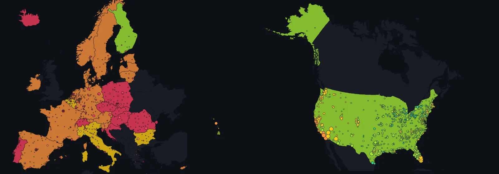
European data: © ESPON · Origin of data: ESPON EGTC. The interpretation of ESPON material does not necessarily reflect the opinion of the ESPON Monitoring Committee. American data: U.S. Census Bureau, American Community Survey 2020–2024, and Freddie Mac.
Your income in square metres
Suppose you earn the average income of the town you live in and put a third of it each month toward a 30-year mortgage at the local interest rate. How big a flat does that buy at local prices? For 44 % of Europeans, less than 50 square metres. This page works out the answer for 11,630 places in Europe and the United States, and for your own income too.
Ask whether a city is expensive and you usually get a price index: 130 here, 97 there, and nothing you can picture. This page answers in a unit anyone can stand inside: square metres. Take what people in a place earn on average, put a third of it toward housing, and count how much space that buys at local prices.
For buying, that third becomes the monthly instalment of a 30-year mortgage at the country's own rate; the loan that instalment can pay off, divided by the local price per square metre, is the answer.
For renting, the same third is divided by the local rent per square metre. In Warsaw the mortgage buys 17 m² and the rent gets you 34; in Milan, 67 and 47.
The idea is not mine. In September 2026 Franziska Sielker and Selim Banabak of TU Wien published a pair of such maps in the Journal of Maps, covering every municipality in Europe and built from 22 million listings gathered for the ESPON HOUSE4ALL project. Their table is the European layer here, reproduced to a part in a billion.
What is new is everything around it. The United States sits alongside, built from the Census Bureau's American Community Survey for all 3,141 counties.
Two Latin American cities, Lima and Buenos Aires, get maps of their own, and four more countries of the region appear through the Organisation for Economic Co-operation and Development (OECD).
A calculator answers for your income rather than the local average, on your own terms. And a job-offer block works out what a salary abroad has to be for you to live no worse than now.
The American half is missing the unit, and that turned out to be a finding. To say how many square metres an income buys you need a price per square metre, and American public statistics have none.
The Census Bureau asks what a home is worth and what the rent is, but never how big it is, and no other public source in the United States measures it county by county.
So the American map answers with the two measures public data does support. Years of income: how many years of a household's income the county's median home costs outright; the median is the middle one, with half the homes worth more and half less.
Rent share: what part of a month's income the median rent takes. There the three square-metre modes are switched off rather than filled with a plausible guess.
Europe and America are never put in one ranking. Europe's income is measured after tax and per adult-equivalent; America's before tax and per household. Europe's price is what sellers asked per square metre; America's is what owners think their whole home is worth.
Line the two up by local income and you would be comparing two statistical offices, not two housing markets. Type your own income, though, and both sides answer the identical question.
Everything is computed in your browser from one embedded table: no request leaves the page, and it works from a downloaded file. The section Where the numbers come from says what was taken from where, what was checked, and what could not be made comparable.
Your income and your terms
Every field here drives both maps, the cards, the comparison and the rankings. Leave the income empty and every place is computed on what its own residents earn on average; in Europe that reproduces the published study. Type your income and every place is recomputed for you: your money and your terms against the local prices.
Each example fills in the fields below for one typical situation. Change anything afterwards; the line under the fields always says exactly what is being computed.
After tax, everyone in the household together. Leave it empty and every place is computed on its residents' average income; type it and the maps, cards and rankings switch to your money.
The study spends exactly one third of income on housing, and that is the default. Move the slider to try a tighter or a looser budget; when housing takes more than 40 % of income, statisticians call the household overburdened.
A longer mortgage means a smaller monthly instalment, so the same monthly budget can pay off a bigger loan and buys more metres. The study's maps use 30 years; its Annex B repeats them for 20.
Empty means each country's own rate: the national fixed rates the study used in Europe, such as 3.01 % in France, 4.00 % in Germany and 8.32 % in Poland, and Freddie Mac's 2024 average rate on 30-year mortgages, 6.72 %, in the United States. Type a rate and it applies everywhere at once.
The share of the price you pay upfront, so the loan only has to cover the rest. The study assumes none, and that is the default. European prices already include transfer tax and notary fees; American values are owners' estimates with no costs added.
Equivalence factor 1.0 (OECD scale). Used only for the line that compares your income with the local average.
Zero switches the filter off. Name a size and three things happen: the map greys out every place where that size is out of reach on your terms, the rankings keep only the places where it is not, and years of income and rent share are measured on that size, at the price asked for flats of that size.
On the US map, where floor area is not published, the slider is off.
The map
Two maps, shown one at a time: Europe by municipality and the United States by county. They do not share one scale, because the incomes underneath them are measured differently; the sources section is blunt about it. Countries are filled with their national figure, and each dot is a place, coloured on the same scale as the fill.
Hover or tap a dot or a country for its numbers, zoom in for more places, and use the search to jump straight to one: it covers both maps and switches between them. The card next to the map shows what your settings mean in the selected place, and what income it would take to live there. The buttons under the card add the place to a comparison table, which appears right under the map.
Selected place
Search a town above or click a country on the map. The card shows what a third of the income buys there on your terms, and what income it would take to get the size you want.
The numbers on this page can be wrong. The data was collected by machine from several statistical sources and reworked here, and both the data and the arithmetic may contain errors. Check a figure against its source before you rely on it; the sources are listed at the foot of the page.
European data: © ESPON · Origin of data: ESPON EGTC. The interpretation of ESPON material does not necessarily reflect the opinion of the ESPON Monitoring Committee. The maps on this page are drawn here from that data; they are not ESPON maps and do not use the ESPON map design. American data: U.S. Census Bureau, American Community Survey 2020–2024 (public domain), and Freddie Mac. Country outlines and county centroids: Natural Earth, public domain.
Side by side
This table appears once you add a place, and holds up to four: towns, counties, regions or countries from either map. The first block of rows follows your settings. The next two hold the terms fixed: first the same share of income and the same term for every place, then the study's own figures, so the places can be compared the way the paper compares them.
To add a place, select it on the map or in the search and press + Add to comparison on its card, or press the + at the end of a row in the rankings. Mix Europe and the United States and the table keeps only the rows both sides have, says what each side is measured on (a flat of the chosen size in Europe, the median home in the United States), and marks no cell as best: the two incomes are measured differently.
Offered a job in another country?
The number nobody gives you is how much the offer has to be for you to live no worse than now. Put in where you live and where the job is; the block works it out twice, for renting the same space and for buying it, with each country's own mortgage rate and currency. Type the offer and it says how far it falls above or below.
It also works across the two maps, on your income rather than either statistical office's. There, because American floor area is not published, it keeps your share of income equal instead of the space, and says so next to the answer.
The place whose rent, prices and income are your starting point.
Town, region or country; it may be on the other map.
Leave it empty to see what the offer must be; type it to see how far it falls short or above.
Rankings
Every number here moves with your settings, and the table stays inside the map you are looking at: European and American incomes are different measurements, and one ranking of both would compare statistical offices rather than housing markets. The minimum size above narrows the list to the places where that size is within reach.
How much space Europeans can afford
Europe only. Take every person in the 31 countries and ask one question about their municipality: how many square metres does a third of the average income buy there? The chart sorts people by the answer. Each bar is one answer, from under 50 m² on the left to over 150 on the right, and its height is the share of Europe's population living in places with that answer.
The colours split each bar by where those people live: in cities, in towns and suburbs, or in the countryside. It is the study's figure 3, rebuilt from the same table and fixed to the study's own terms: a third of the local average income, a 30-year mortgage, the national rate. Your settings do not move this chart.
Read from the table as served in September 2026: 41 % of people live where a third of the average income buys under 50 m², 31 % where it buys 50–75 m²; for renting 37 % and 32 %, with 11 % in municipalities where no rental offer was recorded. The paper reports 44 %, 28 %, 39 % and 22 % for the same four figures, and 12 % of the rural population for the last. The gap is the difference between the map service and the final dataset of the paper, and is discussed under Where the numbers come from.
Latin America: two cities, not a continent
Across Latin America, an official price per square metre by district turned up in exactly two cities: Lima, from its central bank, and Buenos Aires, from the city's statistics institute. So this block shows two cities, each on its own map, labelled by the city and not by a flag: a capital's prices say nothing about the rest of its country.
The layer has no local income, so the maps answer only for your income from the calculator above: how many square metres a share of it would buy or rent there. Until you type an income, they show the price itself.
Below the maps, four more countries appear through the OECD, the Organisation for Economic Co-operation and Development, as a share of income rather than a price.
Before you read the colours
- Two cities, not a continent. Lima and Buenos Aires are capitals, and their prices describe those cities, not Peru or Argentina.
- Do not compare the two maps. Lima's price is what buyers actually paid, collected by the central bank; Buenos Aires's is what sellers asked in listings. Each map is coloured within its own city.
- Buenos Aires is two-room flats. The city's statistics institute publishes the asking price separately for each flat size, and this page shows resale flats with two rooms, the size that covers the most barrios. A barrio appears only when enough flats were on offer in the quarter, so 5 stay grey. The latest quarter is provisional and may be revised.
- The OECD shares are measured differently. Chile, Colombia and Mexico divide by income before tax, Costa Rica by income after tax. Chile's 31.8 % in 2020 comes from a survey run during the pandemic: an outlier, not a trend.
- Every source is credited at the foot of this block.
Four countries through the OECD
The median share of income that households spend on their mortgage, interest and repayment together, or on their rent, from the OECD Affordable Housing Database. Utilities and taxes are not included. The dashed line is Costa Rica, whose share is taken of income after tax; the other three are taken of income before tax.
| Country | Latest year | Share of income | Income measured |
|---|---|---|---|
| Chile | 2022 | 23.7 % | before tax |
| Colombia | 2024 | 20.5 % | before tax |
| Costa Rica | 2024 | 17.0 % | after tax |
| Mexico | 2022 | 14.4 % | before tax |
Sources
- Lima, prices and rents: Banco Central de Reserva del Perú, series «Mercado inmobiliario». Licence: “Puede reproducirse total o parcialmente, sin autorización expresa, siempre y cuando se cite la fuente”.
- Buenos Aires, prices: Instituto de Estadística y Censos de la Ciudad Autónoma de Buenos Aires (IDECBA), serie MI_DVP_AX03, sobre la base de datos de Argenprop.
- Chile, Colombia, Costa Rica, Mexico: OECD (2026), OECD Affordable Housing Database, HC1.2 Housing costs over income, accessed 2026-09-28. Licence: OECD Terms and Conditions, 3. Data.
- Lima, district outlines: Instituto Geográfico Nacional (IGN), via OCHA / HDX «Peru - Subnational Administrative Boundaries». Licence: CC BY 3.0 IGO. Outlines simplified and cropped to the map by this page.
- Buenos Aires, barrio outlines: Buenos Aires Data, «Barrios». Licence: CC-BY-2.5-AR. Outlines simplified by this page.
What the European data shows
Everything in this section comes from the TU Wien study and the ESPON table behind it: 31 countries, asking prices, income after tax per adult-equivalent. The American section follows, and the two do not share a scale.
The two maps measure the same thing from two sides. For buying, the authors take a third of a municipality's average income, assume it goes into the monthly instalment of a 30-year mortgage at the country's fixed rate, and ask how many square metres the resulting loan buys at local prices, taxes and fees included.
For renting they divide the same third by the local rent per square metre. Both answers are in square metres, so places can be compared without knowing a single price.
Close to 44 % of Europeans live where that mortgage buys fewer than 50 square metres, and about 28 % where it buys 50 to 75. Put together, more than 70 % of the population lives in a place where a third of the average income buys at most 75 square metres. Fewer than 5 % live where it buys more than 150.
Renting looks much the same. More than 39 % live where a third of the average income rents fewer than 50 square metres, and about 22 % where it rents 50 to 75.
That worst rental band, under 50 m², is mostly an urban problem: of the people who live in it, more than 65 % live in cities, about 26 % in towns and suburbs and about 10 % in the countryside. Rural areas stand out for another reason: for 12 % of the rural population, the collection of listings found not a single rental offer.
Which country is cheapest depends on how big a flat you want. Small flats cost more per square metre everywhere, but how much more is a national trait, and it is enough to reorder the continent.
Rank the 31 countries by the years of average income a flat costs outright, and moving the question from 25 m² to 150 m² lifts Norway ten places and Spain nine, while Germany and Sweden each fall seven. Germany is the seventh easiest country in which to buy 25 m² and the fourteenth for 150 m²; Spain is nineteenth and tenth.
Nothing about incomes or overall price levels differs between the two rankings. Only the size did.
How far to trust this depends on where the extra cost of small flats was actually measured. In 23 of the 31 countries it comes from the country's own listings in all five size bands, from under 30 m² to over 120 m², and every country named above is among them; in the other 8 the smallest band had too few listings, and the European median is used instead.
One caution the paper is explicit about: where a band had too few listings, the authors filled it in by interpolation, so a band that carries a number was not always actually observed.
The geography is what you would expect, only sharper. The capital region of nearly every country sits in the least affordable class and pulls its neighbours with it: unaffordability spills into the regions around Paris, Berlin and Madrid despite the higher incomes there, and across borders around Switzerland and Luxembourg.
The coasts of France, Spain, Portugal, Greece and Croatia and the tourist valleys of the Alps are far less affordable than the countryside behind them. Scandinavia and the Baltic states come out markedly more affordable, save a few urban hotspots. The map shows this as dots; the rankings and the cards carry the regional figures.
At the country level the authors name Portugal, the Netherlands and Switzerland as rather unaffordable, and likewise Poland and Hungary.
There is a caveat on Poland that matters for reading the whole map: an extremely high share of Poles own their home outright, with no mortgage, so the gap between prices and incomes is not felt by the majority. It is felt by newcomers: young households, and anyone who has to move.
Renting is more affordable than buying in Germany, France, Belgium, Austria and Switzerland, but not in Portugal, Greece, Bulgaria or Ireland. In Vienna a third of the average income rents 52 m² but buys only 31; in Madrid it buys 49 and rents 38.
The authors warn against reading the two maps as a like-for-like choice: a mortgage instalment builds equity, a rent payment does not, and the security of tenure differs. Both maps describe the market from a newcomer's point of view, at today's prices; they say nothing about what current residents pay.
What the American data shows
The American layer rests on a single survey: the Census Bureau's American Community Survey, five-year estimates for 2020–2024. It gives every county four numbers: the median home value, the median household income, the median rent and the population. A median is the middle value: half are above it, half below.
That is 3,141 counties and 100 % of the population of the fifty states and the District of Columbia. It is a survey of households, not a record of sales, and every number below inherits that.
Nationally the median home costs 4.1 years of the median household income, and the median rent takes 21 % of the median monthly income.
What the map adds is how unevenly that is spread: 29 % of Americans live in a county where the home costs five years of income or more, and 9.7 % live where it costs eight or more; 1.8 % live where it costs ten or more.
Where it costs most. By years of income the top of the list is Teton County, Wyoming, at 13.2: that is Jackson Hole, where housing is priced for buyers who do not earn the local income. Then Nantucket at 11.4.
Right behind them sit two of the three most densely populated counties in the country, Brooklyn at 11.3 and the Bronx at 10.9, and those two hold four million people between them, against twenty-three thousand in Teton. Manhattan is 10.5, San Francisco 9.9, Los Angeles 9.3.
The cheapest big counties are in the industrial North and along the Rio Grande: Pittsburgh's Allegheny County and Detroit's Wayne County at 2.9, Hidalgo County on the Mexican border at 2.6. A median home costs about one year of income only in a handful of thinly populated counties in Kansas and Texas.
The rent share should not be read without a warning. Only 1.2 % of Americans live in a county where the median rent takes 30 % or more of the median income, and that sounds like good news only until you notice what it measures: the middle rent divided by the middle income of all households, owners included.
Ask the question household by household instead, as the same survey does, and 51 % of American renters pay 30 % or more of their income in rent. Both numbers are correct; they answer different questions, and a county map can only draw the first.
Where the square metre stops. Everything above avoids the word "area", not by choice. The survey asks an owner what the home is worth and a tenant what the rent is; it does not ask how big the place is, and no other federal survey asks it county by county. That gap is why the three square-metre views are switched off on the US map.
Whether an American home is expensive per square metre is a question American public statistics cannot answer. This page is built on public statistics only, and where they end, the page ends too.
Five years averaged into one number, and a value that is only the owner's opinion. The five-year estimate is not a snapshot of 2024 but an average of interviews spread over 2020 to 2024, expressed in 2024 dollars. It is the only edition that covers every county, because the one-year survey publishes only places above 65,000 people.
And the value is what the owner says the home would sell for, not what anyone paid: a self-assessment, not a sale price. Neither is a defect to be corrected; both are facts to be stated before the map is read.
How firm each county's number is, is published too. Unlike the European layer, the survey ships a margin of error with every estimate, and every county card shows it. For the median county the interval is ±5.9 % of the value; for one county in ten it is wider than ±16 %.
In 187 counties, home to 0.29 % of the population, it exceeds a fifth of the estimate, and the card says so in words. Those counties stay on the map, because the survey did happen there and a blank would be worse than a wide interval that is clearly flagged.
What the Latin American layer shows
Only two cities in the region publish a price per square metre by district, and both are capitals: Lima, through its central bank, and Buenos Aires, through the city's statistics institute. That is why the block above is labelled by city and never by country.
Lima: what buyers paid. Every quarter the Banco Central de Reserva del Perú publishes the price per square metre, in US dollars, of flats sold in 12 districts of the city. In the fourth quarter of 2025 it runs from US$1,392 in La Molina to US$2,463 in Barranco.
The bank also publishes how many years of rent the price equals, and dividing one by the other gives a rent: from US$7.5 per square metre a month in La Molina to US$13.4 in Barranco.
Buenos Aires: what sellers asked. The city's statistics institute, the Instituto de Estadística y Censos de la Ciudad de Buenos Aires, publishes every quarter the average asking price per square metre in listings, by barrio, separately for each flat size.
This page takes two-room resale flats, the size that covers the most barrios: 43 of 48 in the second quarter of 2026, from US$1,437 in Villa Lugano to US$5,805 in Puerto Madero. The quarter is provisional and the institute may revise it.
The institute shows a barrio only when enough flats were on offer in the quarter; the other 5 stay grey on the map.
The two cities cannot be compared with each other. A price paid and a price asked differ by the bargaining in between; one comes from a central bank's survey of developers and agents, the other from listings; and the quarters differ, the fourth of 2025 in Lima and the second of 2026 in Buenos Aires.
That is why each map is coloured on the districts of its own city: green is the cheapest fifth, red the dearest. A green barrio in Buenos Aires does not mean cheaper than a red district in Lima.
No local income, so only yours. Neither city publishes an income by district, so the maps cannot say what a local resident can afford; they answer for the income you type into the calculator above.
Buying also needs a mortgage rate, and the layer has none for either city. None is borrowed from elsewhere: in both cities, buying is counted only at a rate you type yourself.
The OECD adds four countries, as a share rather than a price. Its Affordable Housing Database gives the median share of income that households with a mortgage or a rent spend on it: Chile 23.7 % in 2022, Colombia 20.5 % in 2024, Costa Rica 17.0 % in 2024, Mexico 14.4 % in 2022.
The four are not fully comparable either. Chile, Colombia and Mexico divide by income before tax, Costa Rica by income after tax, which is smaller, so on the others' terms its share would be lower still. Chile's jump to 31.8 % in 2020 comes from a survey run during the pandemic, and two years later the share is back down.
How the numbers were made
- Listings
Weekly web scraping from the beginning of March 2024 to the end of March 2025 in 31 countries: the EU-27 plus Switzerland, Norway, Iceland and Liechtenstein.
Where possible the crawlers targeted aggregator sites such as Nestoria, which mirror listings from several national portals; national sites were added where coverage was thin.
More than 100 million records came in; after translation, de-duplication and outlier filtering, 18,360,314 unique sale listings and 3,568,849 unique long-term rental listings remained. A listing that reappeared week after week counts once, in its last version before it went offline.
- Municipality and size
Each listing is matched to a municipality, the Eurostat LAU (local administrative unit) except in Portugal and Greece, where a coarser unit is used, and to one of five size classes: 0–30, 31–60, 61–90, 91–120 and above 120 square metres.
Prices are averaged by municipality and size class, with less weight given to listings that stayed online much longer than usual: a flat that does not sell for months is probably overpriced. Where a class has too few listings, it is filled in from the neighbouring classes; a smooth curve (a cubic spline) is then drawn through the five points, giving one price-by-size curve per municipality, separately for sale and for rent.
- Income
The mean equivalised disposable income per country from Eurostat's EU-SILC survey (table ilc_di03), spread across municipalities with the subnational income distribution of Mikou, Vallet and Guivarch (2024).
Equivalised means the household income is divided by a weight for household size, so the figure is per adult-equivalent. The authors chose income over GDP per head deliberately: GDP piles up in capitals and financial centres and would make exactly the places that matter look richer than their residents are.
- Mortgage
A third of the income goes to the instalment of a 30-year mortgage with equal monthly payments at the national fixed rate supplied by the European Commission's DG ECFIN, the latest yearly average available, typically 2023.
The price is harmonised to include real-estate transfer tax or VAT, land registry and notary fees. No down payment is assumed, on purpose: it keeps the indicator comparable across regulatory settings. Annex B of the paper repeats the map for a 20-year term.
- Rent
- The same third of income divided by the rent per square metre from the spline. Both indicators are in square metres at the same burden, but the authors caution against comparing them directly: the mortgage instalment builds equity, the rent does not.
- United States: what the source is
The American Community Survey, five-year estimates 2020–2024, published by the U.S. Census Bureau as a federal work in the public domain. Four tables per county: B25077 median value of owner-occupied units, B19013 median household income, B25064 median gross rent, B01003 population.
Dollar amounts in a multi-year file are inflation-adjusted to the final year, so everything here is in 2024 dollars. The five-year file is used because it is the only one that covers every county: the one-year survey publishes only places above 65,000 people.
- United States: what the numbers mean
Median value is what the owner estimates the home would sell for — a self-assessment, not a transaction. Median gross rent is contract rent plus the utilities the tenant pays, so it is higher than a bare rent and is not the same thing as the European rent per square metre.
Median household income is money income before tax for everyone living together, which is neither the European equivalised disposable income nor a per-person figure. Each of the three is stated under its own name everywhere on the page.
- United States: state and country figures
- Asked of the same tables, not assembled from counties. A population-weighted mean of county medians is not a median, and where the real one can simply be requested there is no reason to build a substitute. So the row for California is California's own ACS median, and the row for the United States is the national one.
- United States: no square metres
The ACS does not collect floor area, and no other federal source publishes it by county: the American Housing Survey measures size only nationally and for some large metropolitan areas, and the Survey of Construction only for new houses by census region.
Hence no square metres on the US map, and a note in their place.
- United States: geography
County centroids from Natural Earth's admin-2 layer, public domain, the same source as the country outlines. Nine of them are not there: Connecticut replaced its eight counties with nine planning regions, which the Census Bureau now uses and Natural Earth does not yet carry.
Their centroids are computed here from the federal TIGER 2024 boundaries as an area-weighted polygon centroid, with interior rings subtracted — a calculation on the real border, not a borrowed point.
Puerto Rico's 78 municipios are in the survey but not on this map: they come from a separate survey, the PRCS, and the Census Bureau's United States totals exclude them. The reason is written into the gap file rather than left implied.
- United States: mortgage rate
- Freddie Mac's Primary Mortgage Market Survey, the 30-year fixed rate, averaged over the 52 weeks of 2024: 6.72 %. Not the latest week and not a five-year average — the ACS states its dollars in 2024 money, and the rate has to belong to the same year as the dollars.
- Checks
For five countries where average transaction prices exist at some regional level, Annex A compares listed and transacted prices and finds a very high correlation, with spreads that vary.
The authors expect the spread to be smaller in hot markets, which would make urban ownership look even less affordable than the map already does.
Limitations, theirs and mine
Both the data and the arithmetic can be wrong. The figures were collected by machine from several statistical offices and reworked here by one person: a wrong join, a stale file or a slip in a formula are all possible, and none of the sources has checked this page. Before you rely on a number, check it against the source, which every section links to.
In Europe, listed prices are not transaction prices. The study works from asking prices, and the gap to the price actually paid is not known at municipal level.
Where the price paid is known, it correlates well with the listing, but it follows patterns of its own. The American layer is neither: it is what owners think their homes are worth, which is not a listing and not a sale.
A place is one number, and an American county is a large place. Inside a city the difference between districts can be as large as the difference between regions, and the map cannot show it. A county is coarser still: Los Angeles County holds ten million people and one median home value.
The map also cannot shade regions: no freely reusable outlines of European regions exist at this detail, so this page fills whole countries and marks places as dots instead. Regional and state figures are still in the search, the cards and the ranking.
European local income is an estimate. The survey income is spread across municipalities by a model, not measured in each one.
In several Eastern European countries that spread varies little outside the big cities, so some intermediate regions, neither mostly urban nor mostly rural, may look poorer than they are. The authors ask that absolute values be treated with caution; the patterns are more robust than the digits.
No down payment, no loan limits. The study abstracts from both. The down-payment slider on this page is my addition: it reduces the loan and lets you see what a saved deposit is worth. The limits banks set on a loan, such as a cap on its share of the home's value or on its size relative to income, and other formal barriers to buying are still not modelled.
Your income is not adjusted to match either definition. When you type a household income, the page takes a third of the whole thing, because that is what a household actually spends, and uses the household composition only for the line comparing your income with the local average.
That comparison line is against an income per adult-equivalent in Europe and against a median household income before tax in the United States, and is labelled as such — but the square metres, and in the United States the years of income, come from your money and the local price, and that is the same arithmetic everywhere.
Timing. European listings are from 2024–2025, incomes 2024, rates mostly 2023 averages, population the 2021 census round. The American figures are five-year survey estimates covering 2020 to 2024, stated in 2024 dollars.
So the American side is not a snapshot at all but an average across five years, which in a period of fast-moving prices lags a current market. That is one more reason the two layers sit on separate maps.
The two incomes are not the same quantity. Europe's is a mean equivalised disposable income: after tax, divided by a household-size weight, so it is per adult-equivalent. America's is a median household income before tax, for everyone living together, with no equivalence scale at all.
Both are what their statistical office publishes; neither can be converted into the other without modelling tax and household composition, which would be a guess dressed as a number.
This page does not make that conversion. It keeps the layers apart and offers the honest alternative: put in your own income and both sides answer the same question.
Asking prices against owners' estimates. The European layer is built from listings — what sellers asked. The American layer is built from the survey — what owners say their home is worth.
Neither is what buyers paid, and the two differ from a sale price in different ways, so the two layers' prices are not compared anywhere on this page.
And the two prices include different things. The European figure is harmonised to carry real-estate transfer tax or VAT, land registry and notary fees — in Vienna that is 6.4 % on top of the listed price.
The American figure is the owner's estimate of the home alone: closing costs, transfer taxes where states levy them, and agent commission are all outside it.
So the European price already includes the costs of the purchase and the American one does not, and no attempt is made here to add them to the American one, because the rates differ by state and by deal and estimating them would be a guess.
The American home value is an opinion, not a price. The survey asks owners what they think their home would sell for. That is not a transaction price and not an asking price, and nothing on this page pretends otherwise.
It is the only county-level measure of housing value the United States publishes, and it is used here under its own name.
American rent is gross and per home, not net and per square metre. Median gross rent includes the utilities a tenant pays, and it is the rent of the home in the middle of the range, whatever that home's size.
It cannot be divided into square metres, and comparing it with the European rent per square metre would be comparing two different things — so the American rent share is computed on the county's own median rental and labelled that way.
The American rent share is a ratio of medians, not a count of burdened households. The map says the median rent takes 30 % or more of the median income in counties holding 1.2 % of Americans.
Asked household by household, the same survey says 51 % of renters pay 30 % or more. The second is the number that describes people; the first is the only one that can be drawn on a county map. The gap between them comes from how unevenly rents and incomes are spread among households, and a single number per county cannot show that spread.
There are no American square metres at all. Floor area is not collected by the ACS or by any other federal source at county level, so the three square-metre views are switched off on the US map. Better a switched-off button than a map of guesses.
Beyond Europe and the United States, only two cities. Lima and Buenos Aires publish a price per square metre by district, and they sit on maps of their own, outside the rankings and the comparison.
Adding a country would take a price per unit of area published by its statistics office or central bank, and an empty map with an honest label beats a filled one with an invented number.
Where the numbers come from
Every number on this page comes from a public file that anyone can download without a key, an account or a payment. Here is the whole provenance in one table; the paragraphs after it are the parts that needed a decision.
| Europe, 31 countries | United States | |
|---|---|---|
| Unit of price | Per square metre — which is what makes the affordability question answerable in area | None. Floor area is not collected by the ACS, nor by any federal source at county level |
| Price | ESPON HOUSE4ALL: 18.4 M asking prices from a year of weekly scraping, per m², with transfer tax, notary and registry fees added | ACS B25077: median value of owner-occupied homes — what the owner estimates it would sell for, per home, not per area |
| How many observations | The number of listings per municipality is not published, so a figure based on a handful of listings cannot be told from one based on thousands | Every estimate ships a 90 % confidence interval. Median county ±5.9 %, one in ten wider than ±16 %, 187 counties wider than ±20 % — and the card names it |
| Income | Eurostat EU-SILC mean equivalised disposable income 2024 — after tax, per adult-equivalent — spread across municipalities by a model | ACS B19013 median household income — before tax, per household, no equivalence scale — measured for each county in its own right |
| Rent | ESPON HOUSE4ALL: 3.6 M rental listings, per m² per month, without utilities | ACS B25064 median gross rent: contract rent plus tenant-paid utilities, per home, not per area |
| Mortgage rate | DG ECFIN national fixed rates, latest yearly average, mostly 2023 | Freddie Mac PMMS 30-year fixed, averaged over 2024 — the year whose dollars the ACS reports: 6.72 % |
| Population | Eurostat LAU 2021 table | ACS B01003, same survey and same period as everything else in this column |
| Outlines | Natural Earth 1:50 m country shapes for both maps; county centroids from Natural Earth 1:10 m admin-2, and from federal TIGER 2024 boundaries for the nine Connecticut planning regions Natural Earth does not yet carry. Public domain. | |
| Geographic detail | 8,489 municipalities in 1,251 NUTS 3 regions | 3,141 counties in the 50 states and the District of Columbia |
| Period | Listings March 2024 – March 2025, incomes 2024 | One five-year estimate spanning 2020–2024, in 2024 dollars — an average, not a snapshot |
| Coverage | 31 countries; three more appear on the map without data | 3,141 of 3,144 counties, 100 % of the population. Three lack a median the page needs — one has no income, two have neither a home value nor a rent; Puerto Rico's 78 municipios are excluded as a separate survey |
| Licence | ESPON: reuse with attribution and the required disclaimer, both on this page | U.S. federal work, public domain. Freddie Mac: "Information from this document may be used with proper attribution" |
Read the price and income rows together and the reason the layers stay apart is visible at a glance: one column is asking prices against after-tax income per adult-equivalent, the other is owners' estimates of whole homes against before-tax income per household. Both are defensible measurements. Neither converts into the other.
The paper's data availability statement says the data is available at reasonable request to the authors. No table is attached to the paper; the supplementary files are the two maps as vector PDFs. The numbers on this page therefore came from the next best place, and the following is exactly what happened.
The ESPON map service. The HOUSE4ALL project publishes an interactive StoryMap on the ESPON ArcGIS portal. Its maps are drawn from three public feature services on the programme's GIS server.
One of them, HOUSE4ALL_data_at_LAU_level, carries a row per municipality with the 2024 mean equivalised income, the corrected sale price and rent per square metre, the national mortgage rate and the two affordability indicators of the paper, sa_m2 and ra_m2.
On 14 September 2026 all 89,601 rows were read through the service's query interface, 2,000 at a time, with the centroid of each municipality. That table, trimmed to the fields used here, is published next to this page as house4all-lau-2024.csv (10.7 MB).
The formula was checked, not assumed. For all 78,758 municipalities with sales data, a third of the monthly income, turned into the loan it can carry over 30 years at the row's rate, divided by the corrected price, reproduces the service's sa_m2 to within one part in a billion; the rent indicator likewise.
So the calculator uses the study's arithmetic, not an approximation of it, and with the defaults left alone it shows the study's own numbers.
The corrected price is the listing price, weighted by how long each listing stayed online, with transaction costs added: in Vienna it is 6.4 % above the raw listing price, which is about what Austrian transfer tax, registration and notary fees add up to.
What is taken from the service, and what is not in it. The five size-class prices are in the service, but the published indicators use the overall corrected price, and so does this page.
The degree of urbanisation and the coastal flag come from Eurostat's LAU 2021 correspondence table, which covers the EU-27 only; Swiss, Norwegian and Icelandic municipalities appear as "not classified" in the chart above. Overseas territories, the Canaries, the Azores and Madeira are outside the frame but inside the search.
A third is not 33 %. The paper says a third of income, and the first version of this page read that as 33 % because the slider works in whole percent.
But 33 % is 1 % smaller than a third: 33 against 33.33, a difference of one hundredth of the value. That was enough to put every figure on the page 1 % below the study's own, while the page claimed to reproduce it exactly.
The default is now exactly one third and the slider reads "a third"; move it and it becomes whole percent and stops being the study's setting, which the line under the calculator says.
Checked against the service: the published affordable metres are reproduced to within 8 parts in ten billion on 78,758 municipalities for buying and 5 parts in a billion on 47,154 for renting.
Small flats cost more per square metre. The service carries prices for five size bands as well as the overall average, and the difference is not small: across the whole sample a square metre in a flat under 30 m² costs 28 % more to buy and 38 % more to rent than the average, while one over 120 m² costs 6 % and 17 % less.
The premium is a national trait more than a local one, and it varies enormously, from 13 % in Germany to 83 % in Spain. Wherever you name a size, this page now uses the band that size falls into, so the answer to "I want 25 m²" is no longer a straight-line scaling of the answer for 100 m².
It changes the order of countries: at 25 m² Germany is easier than Spain, at 150 m² Spain is easier than Germany. The headline square metres to buy and to rent still use the overall price, because that is the study's own arithmetic.
Why the map is dots and not shaded regions. No freely reusable outlines of European regions exist at this detail, so the map fills whole countries with Natural Earth's public-domain shapes and marks each place as a dot.
The region names come from Eurostat's statistical code list, which is free to reuse for any purpose. The projection is Lambert azimuthal equal-area, the family the ESPON maps use.
Where the page and the paper differ. The population shares computed from the service (41 % under 50 m² to buy, 37 % to rent) are a few points below the paper's 44 % and 39 %.
The service is the project's data release; the paper's figure 3 was drawn from the authors' working dataset, and the two may differ in population weights, in income year or in the treatment of municipalities without data. The paper's figures are quoted as the paper's; the chart shows what the public table gives.
One source for the whole American layer. The American Community Survey gives every county a median home value, a median household income, a median gross rent and a population, in one release, as a public-domain federal work.
Every row is keyed by the federal FIPS county code, so counties are joined exactly and never by name.
How the tables are read. The Census Bureau's own API requires a key, so the same public-domain tables are read through the open API of Census Reporter, a non-profit that states plainly: "Data on Census Reporter comes from the US Census Bureau and is not copyrighted."
Their server asks callers to identify themselves, so the extractor sends this page's own name and address as its user agent rather than pretending to be a browser.
Connecticut, again, and from the other side. The state replaced its eight counties with nine planning regions, and this time it is the Census Bureau that has moved on and Natural Earth that has not: the survey publishes the nine, the map file still carries the eight.
Rather than drop the state or borrow a neighbouring point, the nine centroids are computed here from the federal TIGER 2024 boundaries — an area-weighted polygon centroid with interior rings subtracted — and each was checked to fall inside the state.
Alaska needed nothing this time: the survey already uses Chugach and Copper River, the units that replaced Valdez-Cordova in 2019.
State and national rows are asked for, not assembled. A population-weighted mean of county medians is not a median, and the first version of this page built its state and national rows that way, from counties.
The ACS publishes every level, so California's row is California's own median and the national row is the national one. The page says 4.1 years of income for the median American home because the Census Bureau's two national medians say so, not because 3,141 counties were averaged into it.
Three counties lack a number, and 78 municipios were left out on purpose. De Baca County in New Mexico has no published median household income; Kenedy and Loving Counties in Texas — populations in the hundreds — have neither a home value nor a rent.
All three are in the gap file with their reason; any new gap stops the build. Puerto Rico's 78 municipios are in the same download but excluded: they come from the separate Puerto Rico Community Survey, and the Census Bureau's United States totals do not include them, and admitting them would change what the country row means.
The size premium stops at the Atlantic. The European data measures how much more a square metre costs in a small flat, country by country, and this page uses it wherever you name a size.
There is no such measurement for the United States, and there is no American price per square metre for it to act on: sizes you name apply only to the European map.
Exchange rates for the income field are the European Central Bank's euro reference rates of 11 September 2026, fixed in the page so that a shared link means the same amount next month.
Sources
- Sielker, F., & Banabak, S. (2026). Where can you still afford to live? – a comparative perspective on European housing affordability. Journal of Maps, 22(1), 2695777. Open access, published 2 September 2026. doi:10.1080/17445647.2026.2695777. Supplementary maps: SalesAffordability2024.pdf, RentalAffordability2024.pdf.
- Sielker, F., Banabak, S., Gerhalter, M., Neuhuber, T., Sutterlütti, D., Dorner, J., et al. (2025). Access to affordable and quality housing for all people: Main report. ESPON EGTC. PDF.
- Sielker, F., Banabak, S., Serra, M., Palma, E., Falcón, L., Sutterlütti, D., & Larrea, E. (2025). Access to affordable and quality housing for all people: Methodological report. ESPON EGTC. PDF. Lists the sites scraped and the processing code.
- ESPON HOUSE4ALL StoryMap and feature services, ESPON GIS portal. StoryMap · HOUSE4ALL_data_at_LAU_level · project page.
- U.S. Census Bureau. American Community Survey, five-year estimates 2020–2024, tables B25077 (median value of owner-occupied units), B19013 (median household income), B25064 (median gross rent) and B01003 (total population), by county, state and nation. census.gov/programs-surveys/acs. A work of the United States government: public domain.
- Census Reporter. Open API used to read those tables and the TIGER 2024 county boundaries. censusreporter.org. Their statement: "Data on Census Reporter comes from the US Census Bureau and is not copyrighted."
- Freddie Mac. Primary Mortgage Market Survey, weekly history of the 30-year fixed rate. freddiemac.com/pmms. Their page states: "Information from this document may be used with proper attribution."
- Natural Earth. County outlines and centroids, 1:10 million admin-2, public domain. naturalearthdata.com. It still carries Connecticut's eight abolished counties, so the nine planning regions the Census Bureau now uses take their centroids from the federal TIGER 2024 boundaries instead.
- Mikou, M., Vallet, A., & Guivarch, C. (2024). Harmonized disposable income dataset for Europe at subnational level. Scientific Data, 11, 308. doi:10.1038/s41597-024-03138-x.
- Eurostat. Mean and median income by age and sex, EU-SILC survey (ilc_di03). databrowser.
- Eurostat. Local Administrative Units, LAU 2021 correspondence table with population, degree of urbanisation and coastal flag. GISCO.
- Natural Earth. Country outlines, 1:50 million, public domain. naturalearthdata.com.
- Eurostat. NUTS region names from the statistical code list GEO, reusable for any purpose with acknowledgement. SDMX code list.
- European Central Bank. Euro foreign exchange reference rates, 11 September 2026. ECB.
- Press coverage with the authors' own summary: EurekAlert!, 2 September 2026; TU Wien news.
ESPON terms. The affordability data used here is ESPON material and is cited as its legal notice requires: © ESPON and Origin of data: ESPON EGTC. The notice also requires this disclaimer wherever ESPON findings are used: "The interpretation of ESPON material does not necessarily reflect the opinion of the ESPON Monitoring Committee." The maps on this page were drawn for it from the ESPON table and are not reproductions of ESPON maps, so they carry neither the ESPON map design nor the ESPON logo. As the notice also requires, a link to this page is sent to the ESPON EGTC.
The study is the work of Franziska Sielker and Selim Banabak of the Institute of Spatial Planning, TU Wien, and of the ESPON HOUSE4ALL consortium. This page is an independent reading of their public data; any error in the calculator or the text is mine, not theirs.