Find your city — 303 cities, 12 measures
avgrebenkin.com/research/cities/
Find your city
303 cities, scored on 12 things people actually move for: safety, health care, the commute, clean air, climate, culture, living without a car, universities, what a local salary buys, whether a flat is within reach, what there is for children, and where you can fly without changing planes. How much each of them counts is up to you: 12 sliders, 0 to 3. Together they add up to a single score for every city, and that score is then set against what living there costs — so you can see which cities charge a lot for what they offer and which give back more than they take.
The whole set: all 303 cities
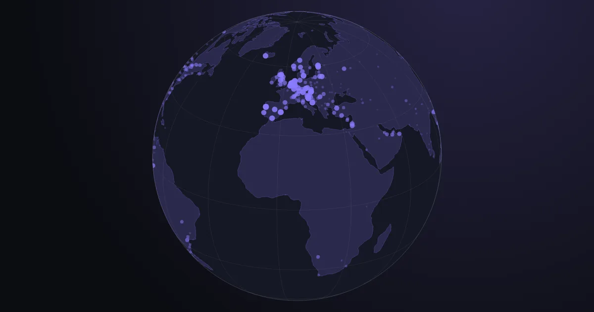
All 303 cities at once. Every dot is one city, and the bigger and brighter the dot, the higher that city scores — the score being how well it does on the 12 things you can weigh up for yourself further down this page. Until you change anything, 5 of them count, and count equally: safety, health care, a short commute, clean air and climate. So the bright clusters are simply the places where all 5 of those are in good shape. Turn the globe, zoom in until the names appear, click a dot to see that city's full scorecard — or type a name into the search box and the globe turns to it (press / anywhere on the page to jump into that box). Everything below the globe cuts these same 303 cities down to the ones you ask for.
Scorecard
No city picked yet. Search for one above, click its dot on the globe, or tap any row in the list further down, and this panel fills with that city's scorecard: where it stands among all 303, then a bar for each of the 12 measures showing how it did on that one alone.
Say what matters to you
12 sliders, 6 ready-made sets
This is where you say how much each of the 12 things is worth to you. Every slider you move rescores all 303 cities at once, so the globe above and the chart, list and table below all redraw the moment you let go. Two more controls live not here but beside the chart itself: which parts of the world to keep, and whether rent is counted as part of the cost of living.
Start from someone
There are 6 ready-made sets of slider settings, each written for a different kind of person — someone working remotely, a family with young children, and so on. Click whichever is closest to you and all 12 sliders jump to that set; from there, move the ones you disagree with. The moment you touch a slider the set stops being highlighted, because the settings have stopped being that person's.
One slider per measure, 12 in all, each running from 0 to 3: a measure set to 3 counts 3 times as much as one set to 1, and anything left at 0 is switched off altogether and takes no part in the score. The sliders come sorted into 5 groups — the basics, city life, money, family, reaching the world — and all 5 start open, so fold away the ones you do not care about.
Your selection: score against cost
Each dot is one of the cities left after your filters. How far to the right it sits is what living there costs; how high it sits is the score it earned from the sliders you set. Good deals therefore gather in the top left — a high score for a low cost — while the top right is where you pay for what you get. Names are printed wherever they fit without covering each other; hover or tap a dot for the ones left unlabelled, and the list below has every city in order.
You have given purchasing power a weight above 0, and it is the shakiest number in the whole set — two warnings come with it. First, money is now on both axes at once: a high purchasing power pushes a city up, while the high prices that usually go with it push the same city right, so wealth is counted twice and the very effect this chart was built to avoid creeps back in. Second, the salaries behind the figure are typed in by whoever happens to fill in Numbeo, and in tech hubs that is mostly tech workers: Hyderabad reports 164.7, second of all 303 cities behind Bern and ahead of Zurich, while Mumbai reports 63.1 and Delhi 66.6. No real economy splits fourfold inside one country. Read this measure as what a Numbeo respondent earns, not as what the city pays.
Every city in order
The same cities as the chart above, only ranked as a list. Neither number is a raw value; both are places in a line-up of all 303 cities. Score takes the measures you left switched on, averages them with each one counted as often as its slider says, and turns the result back into a place in that line-up: 100 is the best-scoring city of the 303 on your settings, 50 is the middle one, 0 the last. Cost is the same idea applied to the cost of living, except that here 100 is the most expensive city and 0 the cheapest. Click either heading to sort by it; hover or tap a row to see that city broken down measure by measure — and tapping also loads it into the scorecard beside the globe.
How this works
Every measure is turned into a ranking before anything is averaged. The raw numbers do not belong on the same scale: museums are counted in hundreds, safety runs from 0 to 100, nonstop destinations run into the hundreds as well — average those as they stand and whichever happens to have the largest numbers drowns out all the rest. So each measure is replaced by the city's place among these 303 cities on that measure alone, from 0 for the lowest to 100 for the highest. Your score is then the average of those places across the measures you left switched on, each counted as many times as its slider says, and that average is itself turned back into a place from 0 to 100 — which keeps the cloud of dots spread across the same range whether you switch on one measure or all 12. Measures where less is better — commute time, pollution, years of income per flat — are turned upside down first, so that everywhere on this page a higher number means a better city.
Nothing here is preset except a place to start. The page opens with 5 sliders up and the other 7 at 0: safety, health care, a short commute, clean air and climate, all counting the same. Numbeo's own quality-of-life index combines much the same things but gives them different importance. Neither arrangement is the right one — which of these things matters, and how much, is exactly what nobody can settle on your behalf, and that is what the sliders are for.
Everything counted off the map is counted inside one circle: 10 km around the city centre. The circle is the same size for every city, 314 km², so a plain count of museums or tram stops is already a count per unit of area, and no population figure has to be brought in to make cities comparable. The other side of that is that a commuter town and a capital are judged on the same patch of ground: the capital's outer districts fall outside the circle, while the small town is measured on a circle that reaches well past its own edges.
Where OpenStreetMap can be trusted, and where it cannot. The map is drawn by volunteers, so a city can look poorly served simply because fewer people have got round to mapping it. To test for that, we counted two things that exist at much the same density everywhere and that mappers always bother to add: bus stops and parks. Across Europe, North America and Asia they come out within 10 % of each other — so the map is not thinner in one part of the world than another, and the differences in everything else can be read as real differences on the ground. And they are large: rail stops and pedestrian streets vary between regions by a factor of 3 to 4. Two candidate measures failed the same test and were thrown out. Kindergartens: Europe came out with 13 times as many as North America, because American mappers hardly use that tag at all. Universities taken from Wikidata: Tallinn came out with none. Universities here are counted from OpenStreetMap instead, and what they really measure is how much ground campuses cover rather than how many institutions a city has — an American campus is one large shape on the map, a European university a scattering of separate buildings — so compare cities on that one within a region rather than across regions.
Purchasing power is the weakest number on this page, and it is worth knowing why. Numbeo works it out from salaries that visitors to the site type in themselves, and the people who bother are nothing like a cross-section of the city: expats and office professionals are heavily overrepresented, and where the site has gathered only a few answers, a handful of people set the figure for a whole city. It shows. Hyderabad comes out at 164.7, second of all 303 cities behind Bern and ahead of Zurich, while Mumbai sits at 63.1 and Delhi at 66.6. A fourfold gap inside one country is an accident of who answered, not a difference between economies. The trap this sets is that a city which is cheap because local wages are low can be rewarded twice over — once for the low prices, and once again for a salary figure that belongs to a narrow slice of its workforce. Push that slider to 3 and you are betting on that slice. The other money numbers — the price basket and the years of income a flat costs — come from the same crowd, but from thousands of separate price entries rather than one salary box, and that is why they hold up better.
Only 6 cities show no flights at all, and that is not a hole in the data. The flights measure counts how many different places you can reach without changing planes, from every airport within 60 km of the city, added together. Kyiv, Kharkiv, Dnipro, Lviv, Odesa and Rostov-on-Don all read 0: those airports have been shut to civilian traffic since 24 February 2022, and were still shut when this was collected in August 2026. It is the one thing on this chart that a crowdsourced safety score does not pick up — and the one number here with a visible expiry date, since Ukraine began preparing a phased reopening of Lviv and the two Kyiv airports in early 2026.
Where every number comes from
Numbeo supplies 9 of the numbers used here: 7 of the 12 sliders, plus the two cost-of-living figures behind the left-to-right axis. All of them come from the 2026 mid-year release — a snapshot fixed on one date rather than the rolling “current” figures the site shows by default, so this chart does not quietly shift under you between visits. Nearly all of it is what visitors to Numbeo have typed in about the city they live in, not official statistics. Safety, health care and pollution are opinion surveys: each answer is scored from −2 to +2, then the average is stretched onto a 0–100 scale. The commute is a plain number people report, in minutes. The prices and salaries behind cost of living, purchasing power and the price of a flat are thousands of separate entries. Climate alone is calculated from measured weather rather than from anyone's opinion.
- Safety
- Fifteen questions put to site visitors about the city they live in: how safe they feel walking alone by day and by night, and how much they worry about being mugged, having a car stolen, being physically attacked or insulted, property crime, corruption and bribery. Each answer is scored, the 15 are averaged, and the average is stretched onto a 0 to 100 scale. It is Numbeo's Crime Index turned exactly upside down, so that a high number here means a safe city.
- Health care
- Site visitors rate the health care they can actually get on 7 counts: how competent the doctors are, how quickly they are seen, how modern the equipment is, how accurate the diagnosis, how courteous the staff, how long the wait, and how much it costs. Cost counts double — as much as any 2 of the other 6.
- Short commute
- Not an opinion but a reported number: visitors say how many minutes their own journey to work takes one way, and what they travel by. Numbeo's index rises the longer and more painful the commute is; this page turns it over, so a high number here means the journey people report is a short one.
- Clean air
- Numbeo's pollution survey, in which residents rate the air and the drinking water, how well rubbish is dealt with and how clean the streets are, noise and night-time light, and how much green space there is. Air quality dominates the result: it carries a weight of 7 out of the 14.5 that all the parts add up to, so roughly half the figure. Turned over here, so a high number means clean.
- Climate
- The one input built from measurements rather than opinions. It is worked out from temperature, dew point and humidex — a comfort figure that combines heat with humidity to say how hot the air actually feels — with points deducted for heat above 31 °C, for cold below 8 °C, and for humidity high enough to be unpleasant. A mild city with few extremes scores high.
- Purchasing power
- The average take-home salary in the city divided by what local prices cost, with New York fixed at 100. A score of 120 means a local salary buys 20 % more there than a New York salary buys in New York. The salaries are typed in by site visitors, so wherever the people answering lean towards expats and tech workers the index reads far too high — Hyderabad at 164.7 against Mumbai at 63.1 is the clearest case of it. Treat this as the loosest of the 9 Numbeo numbers.
- Affordable to buy
- The price of a middling flat divided by a middling household's yearly income — that is, how many whole years of a family's entire income one flat costs, if they spent nothing on anything else. Middling here means the median: half of them are above the figure and half below. A low number is the good outcome, so this page turns it over, and higher means a flat is more within reach.
- Cost (the horizontal axis)
- A basket of groceries, restaurants, transport and utility bills, priced by site visitors, with New York fixed at 100: a city at 41 costs 41 % of New York prices for the same basket. The with rent version adds what a flat costs to rent each month to that basket, and that is the only thing the switch above the chart changes.
OpenStreetMap supplies 4 of the 12 sliders, all counted inside that same 10 km circle. Each is a query that asks the map how many objects carry a given label — an Overpass out count over nodes, ways and relations, run in August 2026. Overpass is the public service for querying OpenStreetMap, and a label, or tag, is what mappers attach to an object to say what it is. Here are the exact tags used, so that anyone can repeat the count or argue with the choice:
- Culture & nightlife
tourism=museum,tourism=gallery,amenity=theatre,amenity=arts_centreandamenity=cinemafor culture, plusamenity=bar,amenity=pubandamenity=nightclubfor nightlife. The two sets are added into a single count, so a city can arrive high here on its museums alone, on its bars alone, or on both.- Car-free living
railway=station,railway=haltandrailway=tram_stopfor places you can board a train or a tram, plus streets taggedhighway=pedestrian, which are streets closed to cars. Metro entrances are left out on purpose: every separate staircase down to a station is its own point on the map, so counting them would hand any city with a subway several hundred free stops. Bus stops are gathered too, but only as a check on the map itself — nearly every city is full of them, so they tell cities apart hardly at all. This is the one measure whose definition changed when the data was rebuilt, so its numbers differ from the first version of this chart by more than ordinary map drift: Kuala Lumpur went from 10 stops to 118.- Kid infrastructure
leisure=playground,leisure=park,amenity=schoolandamenity=library, added together. One warning goes with it: playgrounds are drawn onto the map far more thoroughly in Russia and Europe than in Asia or Latin America, and nothing in the data tells us how much of that gap is a real difference in what has been built and how much is a difference in mapping habits. Compare cities within a region on this one, not across regions.- University presence
amenity=universityplusamenity=college, added together. Two warnings. It measures how much ground campuses cover rather than how many institutions there are: an American campus is one large shape on the map, a European university a scattering of separate buildings. Andcollegemeans different things in different countries — in France it is the collège, the school for 11- to 15-year-olds, which is why Paris shows 407 of them against 149 universities. French cities come out overstated on this measure.
Nonstop destinations — OurAirports and Wikipedia. Every airport with scheduled passenger service within 60 km of the city centre is taken from OurAirports, its table of destinations is read off Wikipedia, and the destinations of all those airports are merged so that a city served by two airports does not have the same place counted twice. The 60 km limit is there to stop a satellite town from claiming the nearby capital's hub as its own. Only 6 cities count 0 — Kyiv, Kharkiv, Dnipro, Lviv, Odesa and Rostov-on-Don. All 6 have been closed to civilian traffic since 24 February 2022: Ukrainian airspace is shut, and Russia's Platov airport at Rostov-on-Don has not reopened either. Ukraine started preparing a phased reopening of Lviv and the two Kyiv airports in early 2026, but not one civilian flight had operated by the time this snapshot was taken.
Every number here was rebuilt from its source on 26 August 2026, and then checked. All 2 727 Numbeo values — 9 measures across 303 cities — were compared line by line against the published mid-year tables, and every single one matched. As a second and independent test, Numbeo's own quality-of-life index was recalculated from our 8 fields and landed within 0.14 points of the published figure for all 303 cities. That test is worth more than it looks: it can only come out right if every value is sitting on the right city, so it also rules out an entire row having slid onto some other city's name.
The OpenStreetMap layer could not be checked against a published table, because no such table exists — so it was simply collected again from scratch, all 303 cities, using the tags listed above. Universities and colleges came back identical for 298 of the 303 cities, nightlife for 242, pedestrian streets for 285; parks, playgrounds, schools and libraries shifted by around 1 %, which is the ordinary drift of a map that people are editing every day. Two cities came back almost empty, and that gave away a real bug: for Cebu and Gdańsk the geocoder had returned the middle of the surrounding administrative region instead of the city centre, which put the 10 km circle in quite the wrong place. Both were corrected by hand and collected again.
Flights were re-collected for all 303 cities as well, and that pass turned up three faults of its own: airport pages whose titles carry accented letters were failing without saying so, one airport in the OurAirports database links to a LinkedIn profile where its Wikipedia page should be, and an empty result was being written into the cache before the fallback lookup had a chance to run. Prague, Atlanta, Kraków, Minneapolis, Dhaka and Caracas had all been reading 0 because of those. The corrected pass moves a typical city by about 4 %, but it repairs outright errors: Charlotte had been listed with 15 nonstop destinations and in fact has 200. Just 6 cities still read 0 — Kyiv, Kharkiv, Dnipro, Lviv, Odesa and Rostov-on-Don — and that one is not a bug: those airports have been closed to civilian traffic since February 2022.